With so many people browsing the internet on the move, it is important that your design looks great on desktops, laptops, mobiles and tablets. I own an Ipad so I usually check the way my websites look on my laptop and on my iPad. I also check how they look on different browsers such as Chrome, IE, Firefox and Safari.
The problem is, it just is not practical to test your website on a range of different devices and resolutions. Are you really going to test your website design on Android phones, iPhones, Android tablets, Blackberry’s etc. A more practical way to check your website is displaying the way it should is to use an online service that checks your design on multiple devices.
There are a number of different services online that help you do this. The one that I have found to be the best is Screenfly from QuirkTools.
The service lets you check your design in a range of different desktop screen sizes, from 10″ netbooks all the way up to 24″ monitors. Alternatively, you can specify the exact screen resolution. Six different tablet devices are supported including the iPad, Kindle Fire and Samsung Galaxy Tab. On the mobile front, you can test your design on nine different mobiles, including the iPhone, Blackberry 8300 and a range of Android phones.
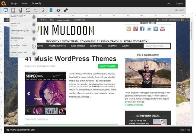
Scrolling can be enabled or disabled and you can rotate the screen too. One of the most interesting features of the service is the ability to check your website behind proxy software. There is a share tool as well that allows you to quickly share the view you were looking at. You will find this useful when working with designers as you can quickly highlight problems with your design to them.
I recommend bookmarking Screenfly for future use as it is a very useful resource.
Thanks,
Kevin
