
Bounce rate. The monster analytics metric you love to hate because, firstly, you’ve heard a high bounce rate is bad for business, and secondly, you probably have no idea what to do to reduce your bounce rate to an all-time low.
But you have absolutely no reason to fear bounce rate. After all, bounce rate is just “…an Internet marketing term used in web traffic analysis. [It’s] the percentage of visitors who enter the site and “bounce” rather than continue viewing other pages within the same site.” [Source: Wikipedia]
Away with definitions, today’s post will show you how to reduce your bounce rate, so you can enjoy better conversions on your website. Without further ado, let’s get to it…
Improve Brand Storytelling
You could be suffering from a higher than usual bounce rate because of three main reasons:
- You’re attracting the wrong audience,
- You’re attracting the right audience, but they leave without interacting with your site because they got all the information they needed on that entrance page, or
- You’re not encouraging users to interact with your site through your brand story. Your story is weak, or unfocused.
What to do? You must improve your brand image and story if you feel this is a problem. Your website should appeal to your clients, investors, customers, suppliers etc – everybody that makes up your target audience.
Let your prospects know who you are, and why you do what you do. You want to get really personal with your prospects. At the same time, you don’t want to come across as “salesy”. Endeavor to provide real solutions to their problems as they move through the sales funnel.

As you conversate with your target audience, they’ll talk to you and in turn you’ll get insight on what to do to help each and one of them.
Over time and after gathering info from your audience, you will have a clear picture of who they are, where they live, why they visited your website and much more, all thanks to tools such as Google Analytics and KISSmetrics among others.
In simpler words, you should endeavor to know what your web visitors want. Then give it to them. You can have visitors fill out short forms and surveys from time to time. It is voluntary and easy work, but that’s not the point.
Make it your business to know who is visiting your site and why. Then remember brand storytelling isn’t all about the story, it matters how the story is packaged. Consider using a web content style guide to style and order your content. Always create content with your audience in mind.
Keyword Research is Still Important
Tools such as Google AdWords Keyword Planner and Google Webmaster Search Queries allows you to understand the competition and how people are finding your website. Keyword research can also be a source of content ideas that can help you improve your story.
Do your keyword research carefully but always remember to create content for people, not search engines. Search engines will send you traffic according to your content. Want to sell to lawyers? Then talk to them, not at the, through your content.
Use the right keywords to improve your online promotional campaigns, so you can attract the right people. This also holds true even if you use keyword-based (PPC) ads to generate traffic. Get specific with your targeting and your bounce rate should come down.
Update Your Content
This ties in very well with our point numero uno up there. Keep your blog updated. Your web content too. Alternatively, you can write content that can stand the test of time. Valuable and evergreen content that will be useful for days. months and years to come.
Because, well, content is still da king.
You can get rid of all dates on your blog as well, because, it might help. I tried this once, but I never measured the results, so I can’t really say how it affected my bounce rates. Also, removing dates from your blog does not make your content evergreen. Writing well-researched content and updating the same according to trends and time is what keeps your content fresh.
Update your content with your target customer, not your preposition, in mind. Fix broken links while at it. Then if your target audience consists of the people in your city or state, go local. Create local SEO content, set up your Google Places profile…you must know the drill by now.
Before we fix your website design and improve user experience (because these two contribute to the bounce as well), let’s improve the readability of your content.
Improve Content Readability
Some webmasters are insane. Why would you work so hard to build a website that has illegible text among other heinous readability and usability crimes? For instance, as I was gathering materials for this post, there’s a particular website that ‘forced’ me to click the back button faster than I landed there.
Why? Glad you asked. The text was too hard to read. What use is a “How to Decrease Your Bounce Rate” article with text that’s extremely difficult to read? My point exactly. End of rant.
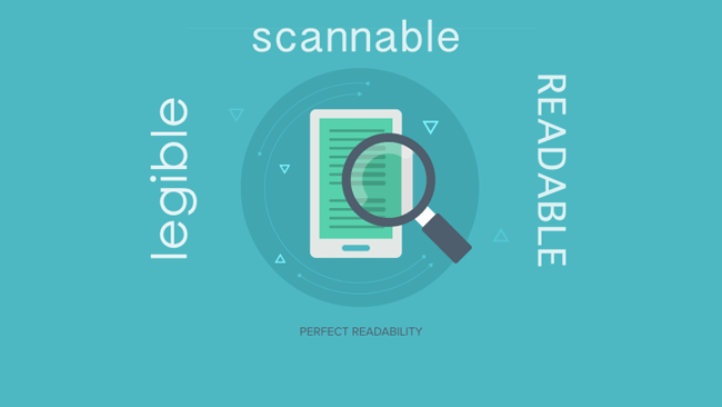
If you don’t want you prospects to click the back button and begone forever, you should at least communicate you’d like ’em to hang around. Format your content to boost interaction, engagement, activity – improve the readability of your content.
How? Let’s get down and dirty:
Headings and Sub-Headings
A wall of text will scare away even The Flintstones (pun intended), so break down long content into sections using headings and sub-headings. A good example is this very post. Don’t just use the headings to divide your content, use theme to capture attention and even communicate messages. Your headings should be short, clear and concise.
Bullet Lists
Eye candy they are, and impactful, when used rightly. They split the content giving it some breathing space, and are great for displaying (listing) related items. Just don’t over do it; three to seven items per list is the standard.
White Space
You will be surprised just how much a bit of extra space around your elements can reduce your bounce rate. High bounce rates thrive on websites that have exhausted real estate through mismanagement of resources. Give your elements a little room to breath, and your bounce rates are bound to come down.
At worst, ensure your elements don’t overlap, because that will just lead to poor user experience (UX). I know, improving content readability feels like UX works, and it is. Content readability is a major bounce rate factor, so make sure your content has plenty of white space.
Good Color Contrast

The website that had me click the back button faster than I landed there did not have this one going on for them. The background was too bright, and the text was too faint – much like they didn’t care whether you’ll be able to read the text or not. They had a poor color scheme for the rest of the design, which made everything worse.
The results?
When you get to the website, your first response is to run for your eyes, which can only mean a higher bounce rate. Choose your colors carefully. The colors should work well together, and should compliment your brand image and story.
Color contrast, bright backgrounds and faint text lead us to our next point.
Pay Attention to Typography
The aforementioned website contained fonts from hell. The font-size was a tad too small, so the whole place looked like a scene from the circus – albeit everything was too tiny and hard to read. Maybe I’m exagerrating, but you should pay attention to your typography because it’s the small things that matter.
I don’t know, just use great fonts that are clear and well-sized. Additionally, use a maximum of three fonts per project. More than that and you’re only asking for trouble, and higher bounce rates. Google Fonts, Typekit and Fonts.com are great resources for some of the best types on the internet.
Link to Related Resources
Your landing page could register high bounce rates because visitors don’t find the information they want on said page. But if you could provide links to back your cause, more prospects will be drawn in and your bounce rate will plummet.
Your landing page attracts many different visistors. Some are ready to buy, register, subscribe etc, but others are not. The ones who aren’t ready to interact contribute to your high bounce rates. If you can get these people to relate with your business, say, after they’ve read more about your mission, then you will have killed two birds with the same stone.
Are you following? Link to related resources, or at least make it clear the visitor can choose to learn more about your business and offers before committing.
Improve Your Web Design + UX
UX is short for user experience in case you’re new. Your website design and the user experience you provide on your site affect your bounce rates as well. Poorly developed websites will have higher bounce rates, that goes without saying. Poor user experience will scare away clients, which results in higher bounce rates.

When hungry, would you sit in a restaurant for one hour if no one was serving you? Perhaps you would, if you’re waiting for a date, and really desperate. But let’s say you were served as soon as you took your seat, but instead of politely taking down your order, the waitress three the tray + menu at your face? What would you do then? Hang back and pretend everything is cool?
Back to web design and UX. Do you think visitors will stick around if your website looks like it was designed by a fifth grader? Do you feel they would hang back and play cool even if they can’t place an order because the UX sucks? Mule over that for a moment.
With that on your mind, which areas of your website should you improve to reduce your bounce rates?
Let’s begin with…
The Navigation System
One day, out of morbid curiosity, I ventured deep into the dense Ngong Forest. I did not have a map or a guide, just my phone and plenty of free time. Everything was all fun and games until I got lost in the dark abyss. Luckily through some miracle, I met a forest fairy and found my way out. End of story.
Why did I tell you my sorry and boring story? Because I went in without a map or even a guide, and got lost. And because I’ve never gone back. It was one experience that I wouldn’t wish to have again.
Create clear and concise navigation systems that are attractive. Such systems will entice prospects to interact with the rest of your website. Don’t create a website without a clear map aka navigation. Otherwise, your readers will be lost, click back and vow to never come back.
Use breadcrumbs so readers can tell where on your site they are at any given time. Breadcrumbs are also great for SEO. On top of that, build a sitemap for your pages, that visitors can use when stuck.
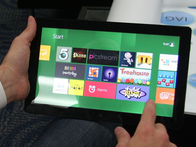
Responsive Web Design
Mobile devices register higher bounce rates than desktop computers for obvious reasons. Most webmasters built their websites to work exclusively on desktop computers. This went well until the vast majority of the world discovered smartphones.
In other words, websites built for desktop computers will register higher bounce rates when viewed on mobile devices. I’m talking about websites with fixed widths and whatnot – websites that aren’t responsive per se.

Ethan Marcotte found a solution to this when he introduced Responsive Web Design (RWD) to the world. Now, if you’re experiencing a high bounce rate because you run a non-responsive website, you only have yourself to blame.
Adopt responsive design so users can have the same great experience on every device, be it a smartphone, tablet, phablet, notebook or desktop PC.
Increase Page Load Speeds
Also known as decreasing page load times, increasing page load speeds involves optimizing your website to load exceptionally fast or at least faster than your competitors. Why is this important? No one has time for web pages that take two lifetimes to open.
If your website takes a trip round the world and stop over at Mordor before loading, your readers will just click the back button or input another URL in the address bar. Time waits for no man, they say, and you’re no exception.
How do you increase your page load speeds? First off, you must identify what is slowing your website down. For this, you can use tools such as Pingdom Tools, GTmetrix and PageSpeed Insights among others. Secondly, you must optimize your site per the recommendations you get from these tools.
Build Creative 404 Pages
You don’t wish web visitors to land on a 404 error page when visiting your site, but it happens more often than not. Perhaps they followed a broken link or mistyped your domain name. My point: landing on the 404 page is inevitable.
If you use a generic “404 Not Found” page, you know, the kind that comes packaged with your hosting plan, the visitor will simply hit the back button. But if you put effort into your 404 error page, you can draw in prospects and lower your bounce rates even without trying.
Use 404 pages that reflect your brand story and spirit. I mean, your error pages should look like the rest of your website. You can sprinkle some humor on your error pages, provide a search box and links to other resources such as your homepage, contact and product pages among others. It’s not a crime to use your 404 page to push your business agenda forward.
Work on User Experience
Neil Patel says in order to lower your bounce rate, you must “…put everything you’ve got into UX.” He further advises you to always put the most important stuff above the fold (within the viewport visitors see immediately your site opens).
Invest in a professionally developed design, use shorter forms to collect customer data, avoid annoying pop ups and don’t let multimedia content that plays automatically to get in the way. Other than that, experts advise that you open all third party links in new windows. Long live target=”_BLANK”.
In simple words, invest time and money in improving the user experience on all your web applications, not just your website.
Use Compelling CTAs
A call to action (CTA) is the action you want the visitor to take when they come to your landing page. It’s one of the many objectives of creating compelling content. It can be any action: signing up for membership, buying a product or service, sharing an article, printing the content – anything!
If you want your visitors to engage, use compelling CTAs to get them to engage – it’s simple as that. You can even incentivize visitors to click your CTA buttons. For instance, you can encourage visitors to buy bundled products for a highly discounted/special price. You can offer a free eBook (or anything else) to get the readers clicking through or signing up to your list.
Every CTA you use creates a conversion path that leads to the sales funnel. The more you create the better. Just don’t overdo it. By general standards, use a maximum of three CTAs on your homepage, and a maximum of two on your other pages. Too many CTAs will just confuse the visitor.
Other than that, all your CTAs should be clear and concise.
And Here We Are…
You should be able to reduce your bounce rates by working on the areas we mentioned above. Ensure you create high quality and relevant content that your audience will find useful. Improve your website design and provide the best UX money can buy. Work on one area at a time and allow enough time to measure the effect the changes have on your bounce rate.
Did we leave out something important? How do you decrease bounce rate on your website? Please share with us!
Adios amigo :)
If you have un-intuitive navigation people are going to get frustrated trying to browse your site for content relevant to them. So definitely would concentrate on fixing up your nav bars if that’s not up to spec.
I tried many tricks e.g. split article to multiple pages but nothing really worked for me. I got a small success with page speed optimization though.
Page speed and usability are SEO ranking signals as well :) Increase page speed and improve usability and you’ll score in the SEO department as well. Thank you Sue for passing by, and the compliment!
Great article! I’ve recently decreased my page loading time and my bounce rate went down.
I hate small, light fonts that are so difficult to read.” 14 is the new 12″ according to Derek Halpern!
Thanks,
Sue