
Table of Contents
I received a comment on my auction for TaekwondoPatterns this morning. When I logged in to Flippa I noticed that the auction listing has been improved.
The new design has a noticeably smaller font. The main details of the auction are now at the top of the auction page instead of the sidebar with traffic and income details remaining on the right hand side.
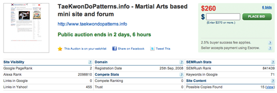
I like the new design as it’s quicker and easier to see important details of the site without having to scroll down the page. I’m sure many will not as keen on it though (people fear change!).
What do you think of the new listing page design?
I’ve been viewing it the last week or so Luke and I prefer the new design. Mainly because the important information is placed at the top of the site :)
@Hendri – Colour is definitely important though I don’t think the Flippa design lacks colour.
Thanks for the review Kevin, glad you like the update. As you said, it’s not going to be everyone’s cup of tea but we think it’s a definite improvement on the old one.
We’ll be considering people’s feedback and will continue to refine the page.
hi…
I think older design is better, it looks user friendly. Yeah, I know this new design have many space for web’s stat, but it less color. in Web design color is very important thing, with color user can see where is important point or nor. I think it’s better for flippa to give more color on web’s stat.