
Rise Forums is the internet community I launched in 2013. It focuses on many topics including affiliate marketing, WordPress, website development, hosting and domains, video and audio, and more.
As with any website, over time that good looking website design you once loved will start to look old and dated. A redesign of Rise Forums was long overdue.
In this case study I would like to walk you through the changes I made to the forum and explain my reasoning along the way. I hope you enjoy it.
The Old Rise Forums Logo
To say that I have poor design skills would be an understatement. I have been using graphical applications such as Photoshop for sixteen years and I have not even mastered beginner techniques. I even did a course on Adobe Photoshop and Adobe Flash back in 2001 and all the information went in one ear and out the other.
This has always been the case. Throughout school my reports said that I was top of the class but that my writing was atrocious. My handwriting remains terrible (thank god for keyboards!) and my drawing skills are embarrassing.
When it came to designing the original Rise Forums logo I took the quickest and cheapest route and created it myself.
You can see the logo below.
There is no mystery as to how the original logo was designed.
All I did was purchase a symbol from Graphic River and then write “Rise Forums” next to it.
The logo served its purpose, however it was time to get something a little better.
The Old Rise Forums Design
Although I think the old Rise Forums design was looking a little dated, I still liked it. It was clean, quick loading, and functional.
I based the design on another design and made a lot of modifications to it to make the design my own.

Even when I launched Rise Forums, the design was dated in some ways. There were premium alternatives available at that time that offered more features.

Rise Forums never had any advertisements, but a short while ago I added some banners to the home page to see how they perform. I also started to think about what else had to be changed from the old design.
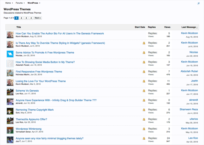
Those of you who have participated at Rise Forums over the years will be familiar with the old design.
The forum design was not something that Rise Forums members ever brought up. In fact, when I did raise the issue about changing the design one time, quite a few members explained that they loved the simplicity of the forum design.
Whilst the old design was functional, it never projected the professionalism I wanted to convey. That is one of the reasons why I wanted to change things up.
The Quest For a New Logo
I find the act of getting a new logo designed one of the most frustrating tasks in internet marketing. This is perhaps due to the number of bad experiences I have had with designers in the past.
It did not matter if I paid hundreds of dollars for a design or whether I hired designers directly or via a competition; the result was always rushed.
That is the reason why, despite my poor design skills, I have just designed basic logos for websites myself.
For this project, I knew I had to get the help from someone who was good at designing. Unfortunately, I encountered the same issues with the new Rise Forums logo as I did previously.
I contacted lots of different companies and then hired a company that had an amazing portfolio. I chatted with the company on Skype for a long time and explained what I was looking for. The next day they submitted a design that was nothing like what I explained. They basically did not take anything I said on board.
They apologised and I explained what was wrong and what I wanted. The same thing happened again and again. Each time they would email me minutes before the day ended so that they would not have to deal with me until the next day. I made a complaint and the owner of the design company contacted me and apologised and asked to give them a second chance. They then proceeded to submit another terrible logo.

The most frustrating part of this experience was that the company was capable of creating good designs. They were just taking more work than they could handle and trying to rush out designs in the hope that clients would accept them.
I lost my 50% deposit on the logo so I just have to write it off as another bad experience with a design company.
When all of this initially occurred I wanted to name and shame the company to warn others, but I do not think any good will come from my doing that so it is perhaps best that I do not.
A few weeks passed and I spoke to another designer who hung out on the YouTube forums YTTalk. I hired him to do the Rise Forums logo, but the quality of his submission was not good so I moved on quickly and did not ask for any other designs to be created.
It was at this point that I was reminded why I hate hiring designers directly. I do realise there are good designers out there, but too many of them seem hung up trying to do a design they like rather listening to what the client wants. The whole process is frustrating.
In my article “9 Ways to Get the Perfect Logo” I talk about an alternative solution. Marketplaces such as Brand Crowd allow you to search through thousands of pre-made logo designs. All you have to do is find a design you like, ask the designer to make the changes you need, and make an offer on the design.
This is the way I am going to acquire all of my logos in the future. It’s such a painless experience when compared to working with designers directly.
The New Rise Forums Logo
I trawled through thousands of logos on Brand Crowd in my search for a suitable logo for Rise Forums.
The service lets you mark your preferred designs as favourites so I bookmarked all of the designs I liked and shared them with the Rise Forums moderator team: Brian Jackson, Rhys Wynne, and Kris Hoja.
We all had different opinions as to what the best logos were, but I found their feedback invaluable. I went back and fourth as to what the best logo was but in the end I chose one that Brian said he had liked.
I first came across the logo on Brand Crowd, however I found that the seller was selling it cheaper on another logo marketplace called Stock Logos so I opted to purchase the logo there.
I liked this logo for a few reasons.
The overall design of the symbol looks like a speech bubble; which fits in well with Rise Forums since it is a discussion forum. The logo is colourful and the colours going from light to dark at the top are a good representation of the word “Rise”.
I love the simplicity of the logo too. I had considered using the letters R and F in the logo or using something like a rocket ship to signify rising, but I feel an abstract logo worked best.
Choosing the New Forum Design
My search for a suitable forum design was more straight-forward.
There are a lot of great forum design companies creating themes for Xenforo. This includes companies such as Brivium, Pixel Exit and Audentio.
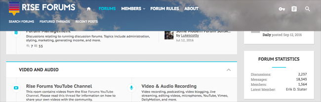
I considered one of the Brivium designs though in the end it was the Xenith design from Audentio that had everything I was looking for. It is highly configurable and the company have a great reputation in the Xenforo community for providing good support and regular updates.
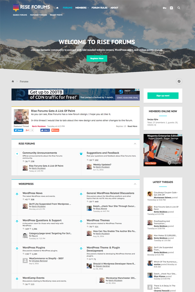
The theme has a lot of great features and looks great on mobile devices or desktop computers.
The settings area has over a dozen different sections with hundreds of options. You can enable and disable common design elements at the click of a button. The level of detail is incredible.
The post area looks much better now. A larger avatar is displayed for each member next to their posts and the whole area looks more refined.
Despite me launching the new design, there are still a few aspects of it I want to change.
The top navigation menu currently displays a background image of sky and mountains. In my announcement post about the new design a few members have suggested trying a different background image. Brian Jackson also suggested dropping the background image altogether and just using a dark background. I will look at some alternative background images and see if any fit the forum design better.
At the moment I have enabled a sticky navigation menu that displays whenever you start scrolling up the page. I have found it useful so far, though I may review this later as I know some people do not like sticky menus.
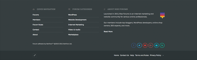
I really love the look of the new footer. The theme lets you easily integrate sharing buttons and content into one of four columns.
I added some links in the footer area to the main areas of the community though I may change what is displayed later as users can find these pages through the top and bottom navigation menus.
Thankfully, making changes to the footer in the future will be a breeze since it is all handled through the theme settings area.
Another thing I am not 100% happy about is how my new logo integrates with the forum design. I think the new logo works best against a light background. To make the logo fit better with the image background I added a small white outline around its edges. It is not the perfect solution, but it will do just now until I figure out the best setup.
All in all I am happy with the logo and the new forum design. Members appear to share my view that it is an improvement over the last design.
A Small Fee to Join Rise Forums
I have made a couple of other changes to Rise Forums recently.
The first major change was implemented about a month or two ago. A small sign up fee of $10 was introduced for new members.
The sign up fee was introduced in order to stop spam and it has been highly effective. Spam is a huge problem that all forum owners face. It is not uncommon for aspiring forums to close down because of volume of spam they receive.
I tried many different free and premium solutions in order to tackle the high level of spam the forum was receiving. Most of these solutions focused on preventing spammers from registering on the forum in the first place.
Unfortunately, in order to prevent spammers from signing up, most solutions involve making the registration process more difficult. For example, new members have to complete a complicated CAPTCHA form in order to complete their registration.
Whilst this setup can reduce spam, it does not eliminate the problem altogether and it makes registering for Rise Forums a big pain in the ass for legitimate members who are trying to join the community.
One of the problems with these anti-spam solutions is that many spammers are now signing up manually in order to post links. There are many companies in Asia who promise to increase incoming links to your website by posting links to your website in discussion forums. These services submit spam manually for their clients. They can be a big pain in the ass for forum owners.
A small sign up fee eliminated all of these issues.
- Auto-registration software can no longer register accounts on my forum without making a payment
- Spammers no longer sign up manually because they do not want to pay money in order to spam
- The registration process is now pain-free for those who do want to join
- Staff do not need to spend time vetting members and moderating spam from spammers
The sign up fee has also improved the user-experience of existing members. I had previously been forced to add anti-spam controls to stop spammers completely ruining the community. For example, new members had to be registered for a certain length of time before they could include links in their posts.
Many members found this frustrating as they were unable to post links or share relevant articles. I could relate to their frustration. It was never something that I wanted to introduce to the community, but it was the only sure way of stopping spammers attacking the forum. Thankfully, Rise Forums members no longer face such limitations.
I feel that the new sign up fee has been a huge success.
I am aware that the introduction of a sign up fee may stop some good people from joining the community, but this is a small price to pay in order to eliminate spam and provide a better experience for members.
Monetising Rise Forums
Advertisements is something that I have never had on Rise Forums since its launch in 2013. I was always focused on growing the community before adding sponsors, but I know the forum also needs to start making money because it has always run at a loss.
About a month or so ago I added a couple of banners to the home page to see how they performed and when I launched the new forum design this week I decided to add a banner above and below the main content area.
In a month or so I will review the stats and see how the banners have performed. One option would be to keep the banners indefinitely and remove them for members who pay a small monthly fee.
To be honest I have not did a lot of thinking about this issue at this time. I will be able to make a better judgement call at a later date once I have more data available and see whether ads are performing well or not.
Final Thoughts
I hope you have enjoyed this short case study of my rebranding of Rise Forums.
Modernising a website design is something that we all have to do from time to time. For me it was something that was always on my todo list and for one reason or another it always got pushed to the back of the list.
I wish I made the job a priority sooner. I also wish that I did not spend as much time as I did searching for a logo. I had decided on the forum design months ago, but I wanted to launch the forum with a new logo at the same time. In hindsight, I should have just changed the forum design and then changed the logo at a later date.
There are still a lot of things I want to tweak and improve on Rise Forums though I believe the hard work has been done. I am looking forward to taking Rise Forums forward and making it a success.
Thanks for reading.
Kevin