CyberChimps have been developing WordPress themes since 2010. I have reviewed many of their designs in the past, such as e-Shopper Pro.
Whilst they do still have their older designs for sale, the company is focusing all of their attention on their Responsive design now. It’s a modern design that has been downloaded by over one million people.
Responsive is free to download, however, a pro version is available that adds premium template designs and other features. I actually reviewed an older version of Responsive Pro a few years ago, however, it has changed significantly since then.
Let’s take a closer look at what the Responsive WordPress theme can do.
What Does Responsive Offer?
Responsive has an adaptive design that looks good on desktops, tablets and mobiles. It integrates well with the official WordPress AMP plugin.
As you would expect, the plugin works well with popular caching and SEO plugins too. There is great support for WooCommerce and Elementor too.
All customisations are handled through the WordPress theme customiser. This allows you to see changes in real-time. There are options for your layout, typography, menus, and more.
Responsive supports an addon that can import pre-made designs. This will help you create a professional website in minutes.
Customising Your Website with Responsive
Responsive can be downloaded free of charge from WordPress.org. If you prefer, you can install the theme directly through your WordPress admin area via the WordPress themes page (Click on “Appearance” and then “Themes”).
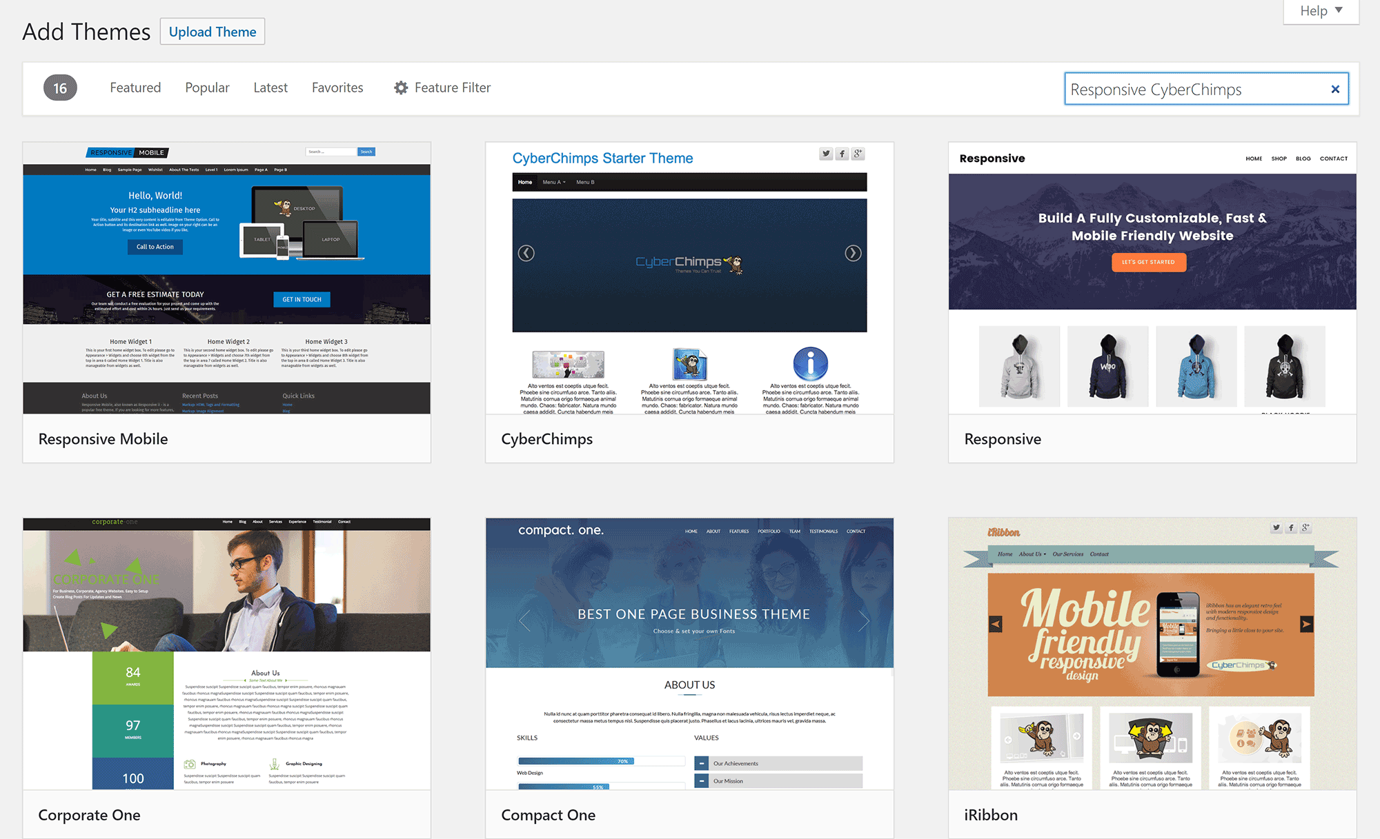
As there are hundreds of themes that are using the tag responsive, I recommend searching for the theme using “Responsive CyberChimps”. This will help you find the correct theme.
Like many WordPress themes, the base layout of Responsive looks plain. This can be resolved easily as there are hundreds of options in the WordPress theme customiser to help you change colours, adjust the layout and make everything look more professional.
In the preview area, you will see many different pencil icons. Clicking on one of the icons will load up the corresponding options for that element. It’s a simple feature, but it really does help when styling your page.
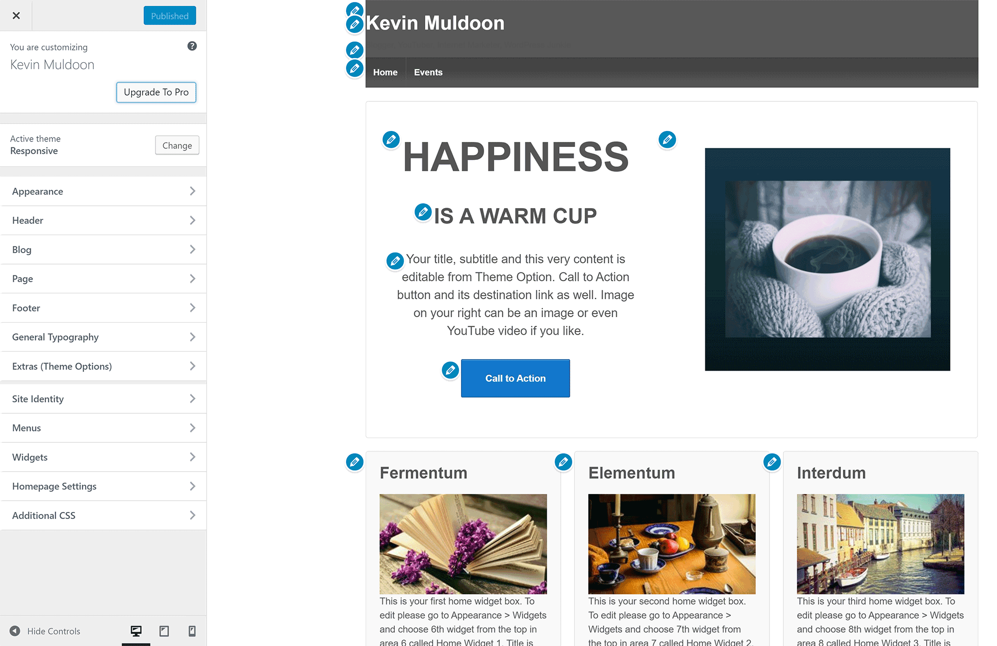
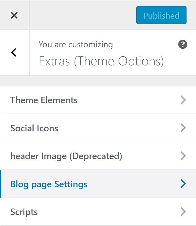
In addition to styling options, menus, and widgets, there is a section for extra options.
This area displays many miscellaneous settings such as overriding WooCommerce templates, enabling featured images, excluding categories from blog pages, and displaying your blog title. Scripts can also be inserted into your header and footer templates from here.
There are pros and cons to putting all options inside the WordPress theme customiser, but I am generally a fan of this approach as it means that you can see all changes in the preview area as you make them.
The Site Importer
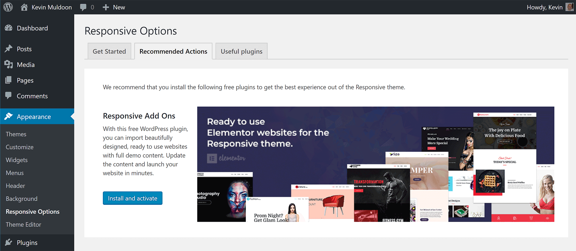
All theme customisations are handled through the WordPress customiser, however, there is an options area for the plugin.
The Responsive Options page, which can be found under the main WordPress Appearance menu, links to the theme documentation page.
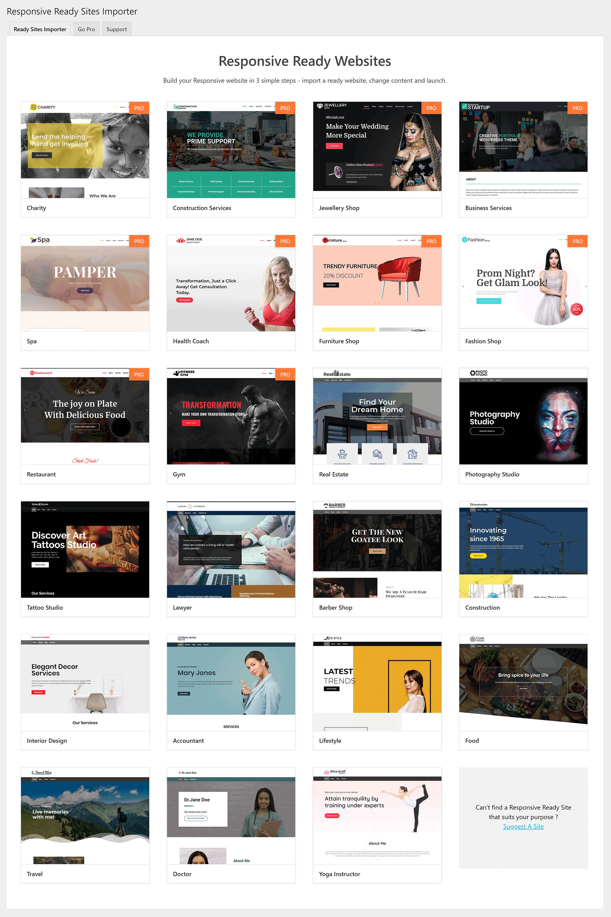
The main reason to come to this page is to install the addon that will allow you to import demo designs called “Ready Websites”. You can activate the plugin from this options area. Alternatively, you can download the plugin from WordPress.org. The plugin is called “Responsive Ready Sites Importer“.
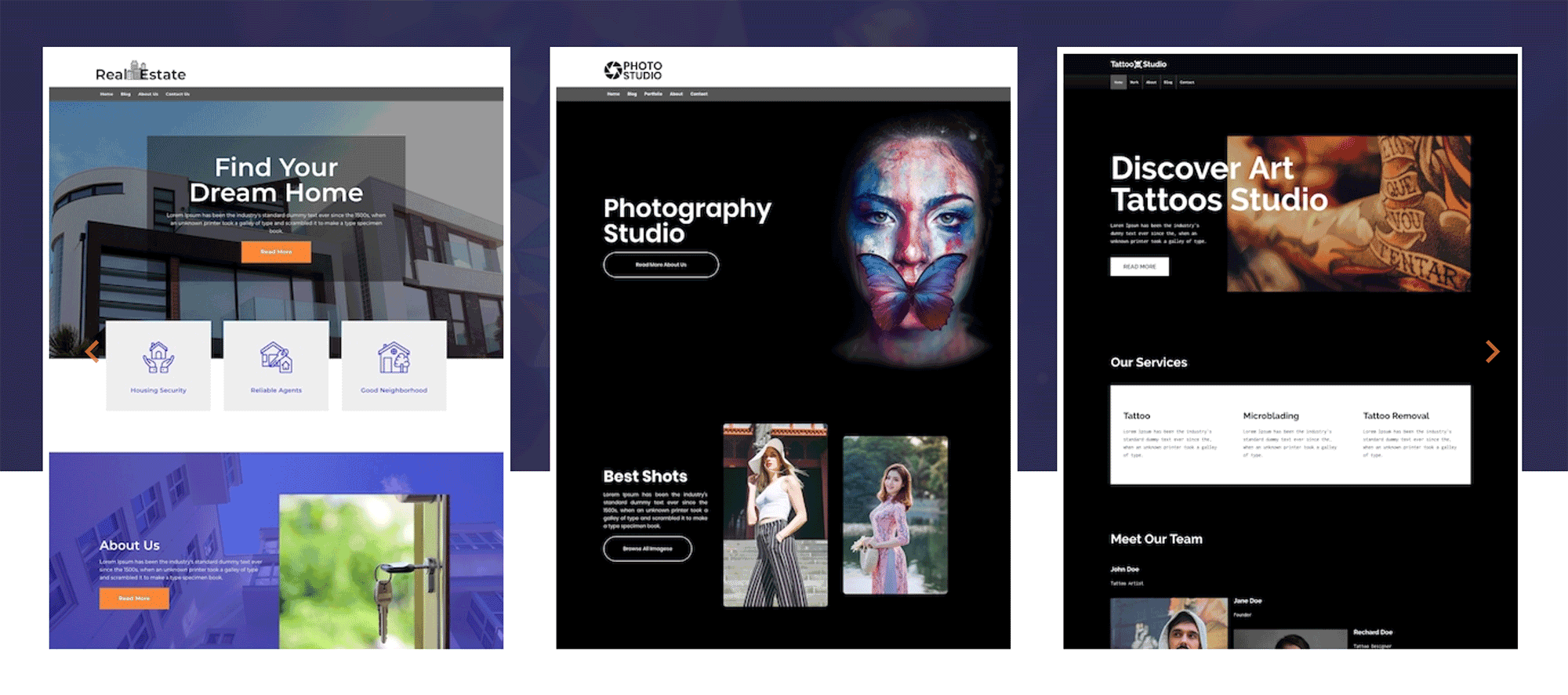
A total of 23 pre-made designs are available. 13 of these designs are available to those that use the free version of Responsive.
The designs require the drag and drop plugin Elementor to be installed to work correctly.
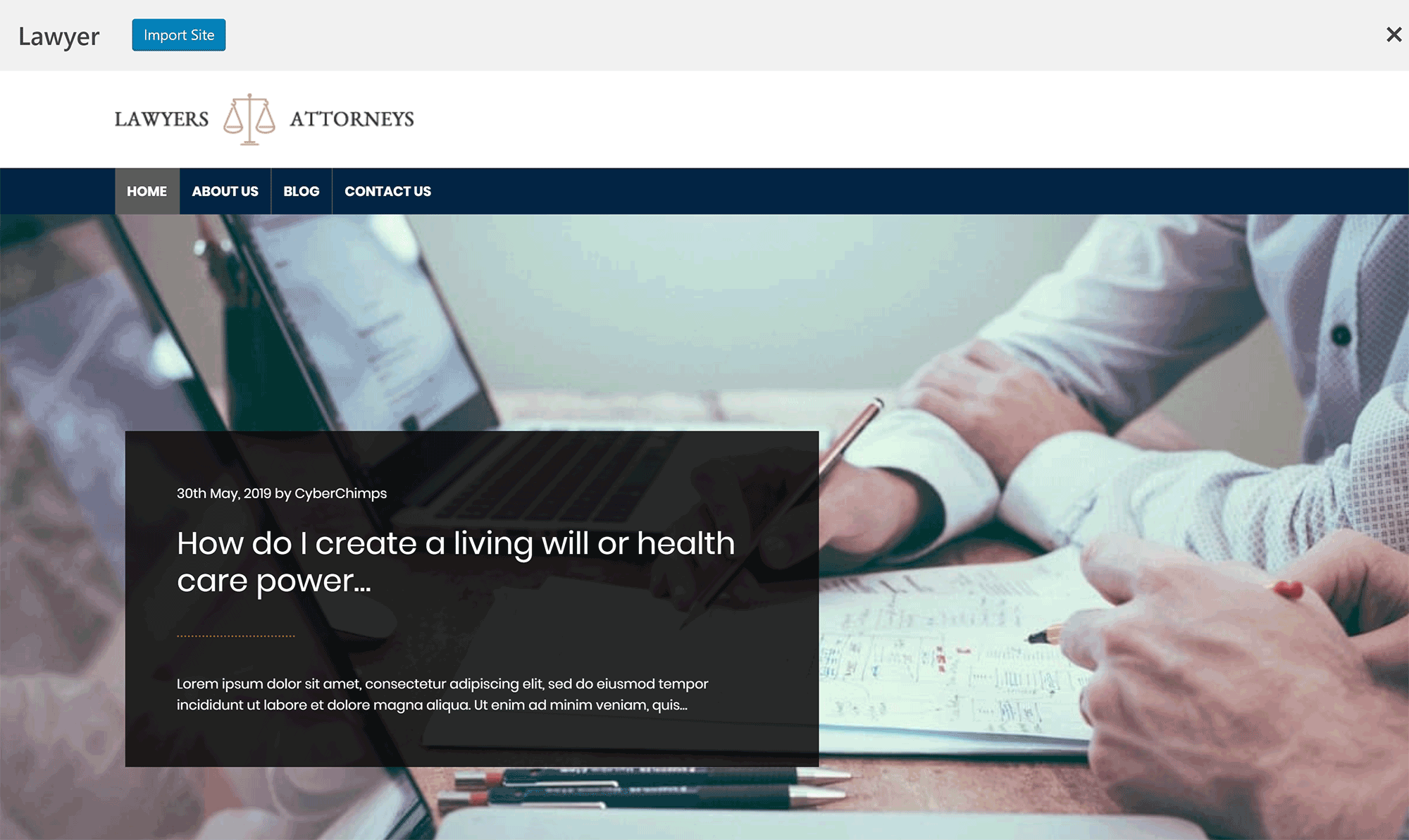
Clicking on a template will show you a preview of the design. At the top of this page, there is a button to import the design into your website.
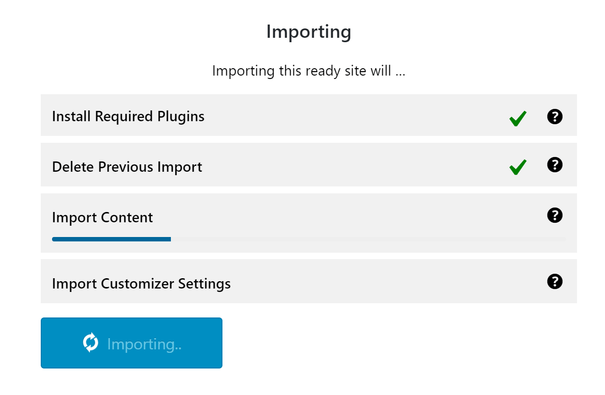
On the next page, you are shown what will occur if you do import the design. You then need to confirm that you want to proceed.
One thing I like about the import process is that it will delete previously imported content.
The Ready Website feature is a great addition to Responsive and one which I recommend trying out.
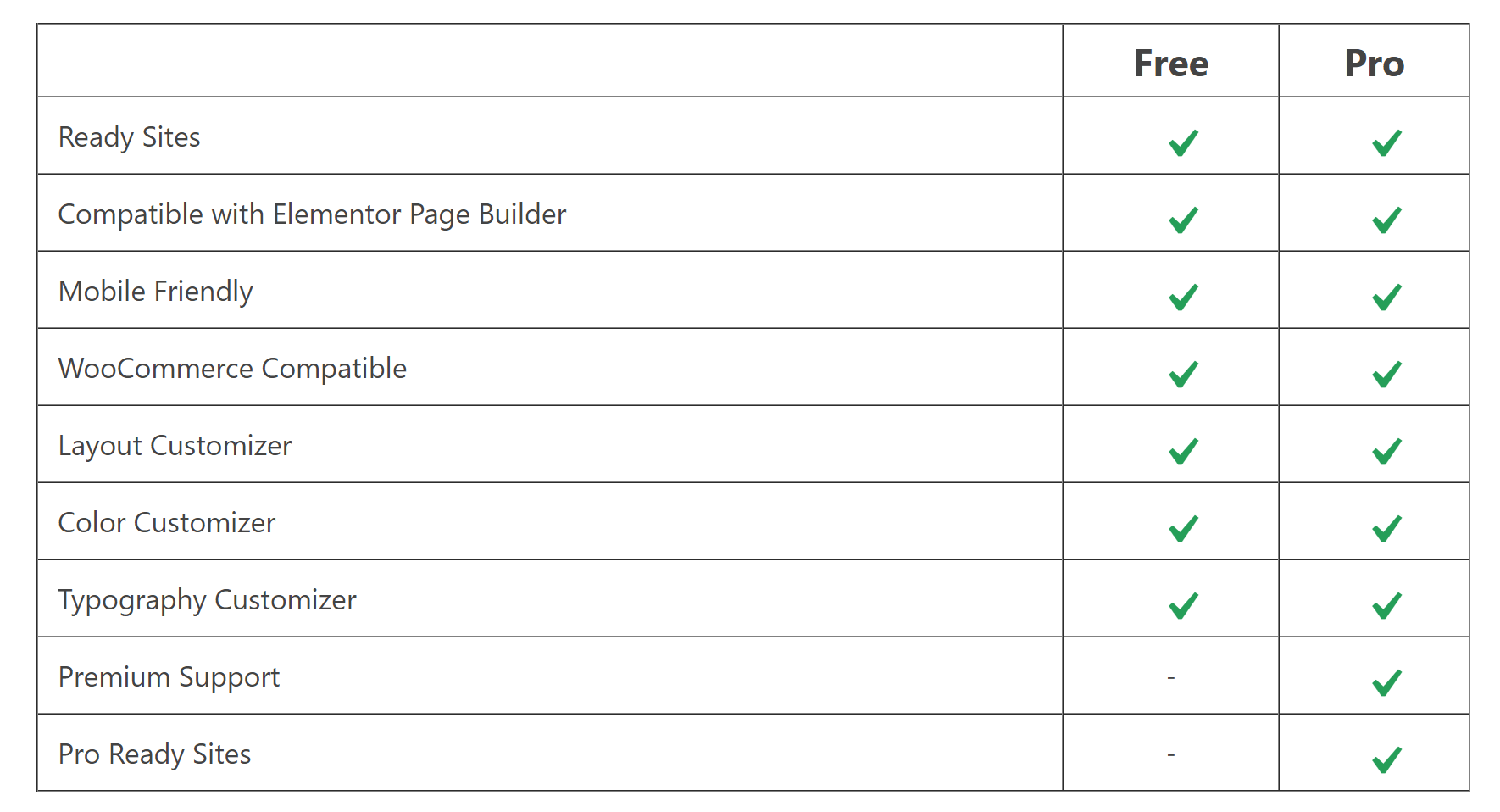
Responsive Pro
The free version of Responsive is not restrictive in any way, but upgrading to the pro version will allow you to get support for the theme and give you access to the Pro Ready Website designs.
A license for Responsive Pro only costs $27 per year. This grants you support for one website.
Other license options will be made available in the future.
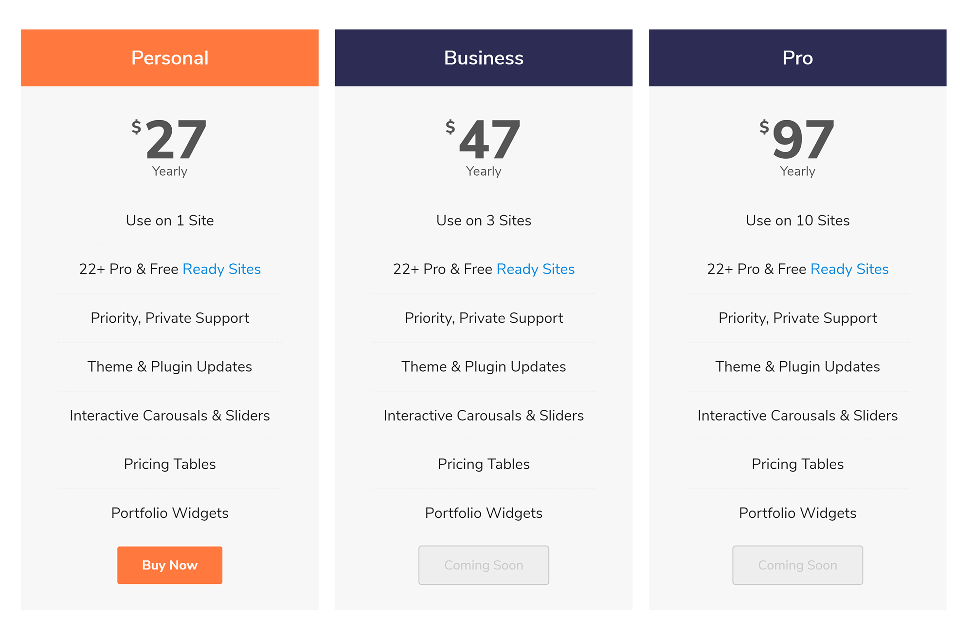
All pro licenses come with a 30-day money-back guarantee, so you can get a full refund if you are not happy with your purchase.
Final Thoughts
Without doubt, Responsive is one of the most flexible free WordPress themes on the market. CyberChimps have improved it a lot over the last few years.
It has a ton of options in the theme customiser and there is a good selection of pre-made designs on offer too.
I encourage you to check it out for yourself and see what it can do.
Kevin