
You may have noticed that I changed the design of KevinMuldoon.com a few days ago. It was something that I had been meaning to do for a while as I was a little bored with the previous design.
There was nothing wrong with the last design per say. I just felt that it had too much spacing and I had set the featured images to be too large. Both of these issues could have been easily changed through the stylesheet and settings area; however I had been using the design since May 2013, so it was time for a change.
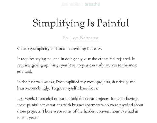
In my search for a new design, I looked at over a thousand WordPress themes. My initial thought was to go with something minimal. One of the themes I tested was Leo Babauta’s ZenHabits theme. The design is the definition of minimal. It has beautiful typography, no sidebar, and no unnecessary features.
After playing around with the design a little, I felt that it was not suitable for this blog due to the lack of sidebar. This would make navigating this blog a little more difficult. A sidebar can easily be added to the theme, so I would never rule out me using the design in the future.
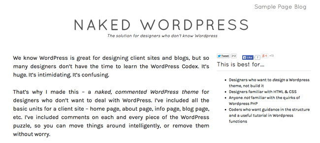
I also tested the Naked WordPress Theme. Unfortunately, I could not get the design the way I wanted, so I looked elsewhere.
It did not take long for my search for a new WordPress theme to change from optimism to frustration. I looked through several hundred designs on ThemeForest alone, but every design seemed to excel in one area, but fall behind in another.
I also checked out a lot of Genesis child themes at StudioPress, but they have not released any suitable blog designs in a while. After testing many more free designs and premium themes I had purchased past, I downloaded the Minimum Pro child theme for Genesis. Before I had switched to the Metro Pro theme last year, I had been using the Minimum child theme for over six months. Since then, the design has been tweaked a little and had its name changed from Minimum to Minimum Pro.
After playing around with the design a little, I realised that it had everything I was looking for. I made a few small changes to the design such as adding a newsletter subscription form at the top of the page and expanded the header to show my big ugly face :)
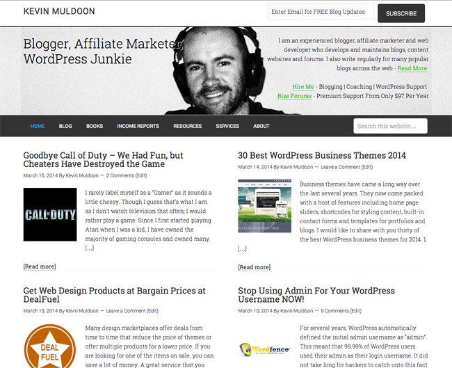
The new design has the same look and feel as all StudioPress themes, so browsing the site and reading articles has the same feel as before. I may make some more tweaks over the coming weeks, however I am pretty happy with the way it looks at the moment.
What do you think of the new design?
Kevin
Thanks Rick. I’d love to say that was by design. In truth, I didn’t have many suitable photographs of me on my own. And the one that I found that was suitable, was in black and white :)
I like it Kevin. I like the minimalist design and layout. I also like the way it reminds me of an old fashioned newspaper from years ago with grainy black and white photos. I mean that in the nicest possible way!
Glad you like it Alek.
I like :)
Yeah the internet was a different beast in the days of Geocites. People would place spinning gif images on their websites for no reason at all. I think I did that myself a few times.
I am sure designs will continue to evolve over the next few years. Perhaps we will come full circle and go back to pages of animated gifs.
I like it.
I’m a minimalist in everything except my website and blog themes – there I’m louder and more confusing than Marti Gras, so I appreciate the elegant simplicity of your new design.
It’s funny watching the trends change in website design over the years, from those half-page animated gifs to simplicity, then back to full-sized graphics again.
I guess it all depends upon what your visitors like and how willing they are to wade through the design to get to your content.