
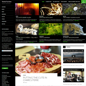
The WordPress default theme has always been an important part of the development of WordPress. Three years ago, the Twenty Ten default theme raised the bar for all WordPress developers. The theme was a replacement for the old Kubrick design; which was looking very dated at the time. Twenty Eleven and Twenty Twelve improved upon the idea of Twenty Ten, however it was certainly more evolutionary than revolutionary.
On the first day of this month, WordPress released WordPress 3.6. It came packaged with this years new default theme: Twenty Thirteen. You may recall my thoughts on the design when I reviewed it six months ago.
Overall, I was a big fan of the design. It was good to see WordPress move away from the safe minimal designs that they had used for three years.
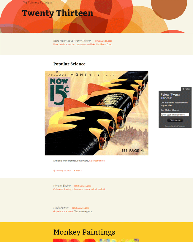
Whilst I did like Twenty Thirteen, its single column design made it impractical for any of my websites. Therefore, it is not a design I see myself ever using.
The Twenty Fourteen WordPress Theme
Rather than develop a theme from scratch, this time WordPress has opted to develop a theme that was initially sold as a premium design on WordPress.com. Designed by Takashi Irie, the theme was initially known as Further; however two weeks ago Takashi broke the news that the design will now be developed as Twenty Fourteen.
I’m on paternity leave right now and this amazing news came out of the blue for me.
The default theme for 2014 which will be released with WordPress 3.8 will be based on the magazine theme I designed–Further. As a WordPress theme designer, it was absolutely incredible news for me personally and I’m ridiculously stoked.
Here is the demo site and the theme is already in WordPress trunk as Twenty Fourteen, so yes, svn up, everybody! From now on, it will be improved by hundreds of people from WordPress community, and I am really honored.
I have no doubt that many people will be both surprised and pleased to hear that the next default theme will be a magazine design. My first impressions of the design are very positive. It does not look like the magazine designs that are popular on ThemeForest. It looks more like a hybrid magazine and personal theme design with a magazine style in the header and a personal blog design underneath.
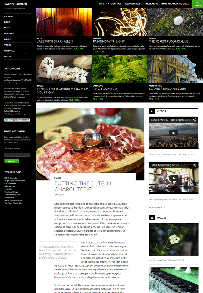
The demo page showcases the theme using a three column design with a fixed navigation bar at the top and a left hand column that lists categories. Featured images are displayed at the top of articles with meta information area cutting into the image.
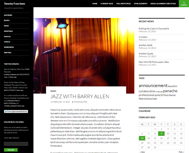
Twenty Fourteen looks like a design that I could use on KevinMuldoon.com as it has everything I need. The demo page shows off a full width page that only has one sidebar on the left hand side. I generally prefer sidebars to be displayed on the right hand side of the page as eyes are automatically drawn from left to right on a page. It remains to be seen whether the main sidebar can be switched to the other side.
Development of the theme is still at an early stage. So it remains to be seen how the design can be configured by users. As a default WordPress theme, I am positive that features such as the theme customizer will be supported.
The great theme about default WordPress themes is that the theme will be packaged with every version of WordPress. This leads to many people using the theme. Default WordPress themes are always coded well too. This leads to many theme developers designing unique custom versions of the theme and using the theme as a basis for other themes. This is what interests me. Even if I find that Twenty Fourteen is not right for me out the box; I am sure that I will be able to customise it myself or find a custom version of it that does suit me.
The bad news is that we will probably not see a beta release of Twenty Fourteen released until early 2014. WordPress have only taken over the development of the design over the last few weeks, so it will be interesting to see how it changes over the next six months.
If you want to check out the theme for yourself, please visit twentyfourteendemo.wordpress.com. You can read more about the initial development of theme theme in a behind the scenes interview at ThemeShaper.
Thanks,
Kevin
Even I don use them on every blog, I am using it on one of the recipe blogs where the Important Note: written in different color looks visually appealing. Thankfully I had used it on some 20 posts, I think I will be able to edit them manually and find a way to ad it using css codes.Thanks for you advice.
As a rule, you should never use shortcodes that are built into a theme as the functions are built into the theme itself. A better solution is to use a shortcodes plugin as that can be used with any theme.
Personally, I do not want to use anything to my content such as a shortcode. You never know when a theme or plugin will stop being supported. If it does become unsupported, you are faced with the task of removing code from hundreds or thousands of articles. Therefore, styling your content using shortcodes is a good idea in the short term. In the long term, it will give you hours of additional work and hassle.
It is always better to style your content using CSS. CSS code can easily be transferred to new designs.
Kevin
This upcoming Twenty Fourteen theme looks great. I am looking forward to see how and what changes are being made by the Wordpress team.
One problem I have found with all in one themes that they make little tough to change the theme in future, For example, if you have been using a short code feature from a theme, you will have errors once you changed the theme,
This is the problem I am going to face with one of my blog.
I believe the theme will support websites that do not use images. It is really only the featured posts area at the top that has a magazine style. The rest of it looks like a personal blog design. So I believe it can be used without it.
The fact is that images are very important. It has been shown that articles with images are shared much more than those without. Plus, it only takes a minute or two to crop and image and upload it as a featured image.
The problem with most magazine themes is the over-reliance on images. Frankly, finding a suitable image or creating one takes a lot of time and many of my posts go without images. The blog layout should support both image-rich sites and content-rich sites, without being over dependent on the authors to provide images for every post. I use 2012 and I love it (I was using 2010 before that). I hope to switch to this new design if the theme looks good without custom images for each post. Please hear it out WP!!
Yeah the newly released Twenty Thirteen is better for personal blogs. From a speed perspective, all of the default WordPress themes have been very quick. I am sure this one will be too.
I personally think Twenty Thirteen is useless for advanced bloggers. It is great for newbies and folks that just want to share thoughts or stories, it’s more like a turbo diary with great backend :) But it will also suitable for photographers (who don’t want portfolio).
Anyway, It’s great that next default theme will be totally different layout than we used to. I pray they won’t overdo the design, it’s should just fast and responsive.
WordPress authors should pay more attention, to built in social widgets, Google authorship and SEO options like Yoast’s plugin have, but beautiful free and 100% safe theme is also a good additive to WordPress.